
Customisable Dashboard for Threat Visibility
The Project
The Problem: CyberOwl's static dashboard served users ranging from lone IT operators to enterprise security teams—but everyone saw the same overwhelming view, leading to low adoption and confusion
CyberOwl is a Cyber Security company headquartered in the UK, offering cyber risk monitoring and resolution for the maritime industry globally.
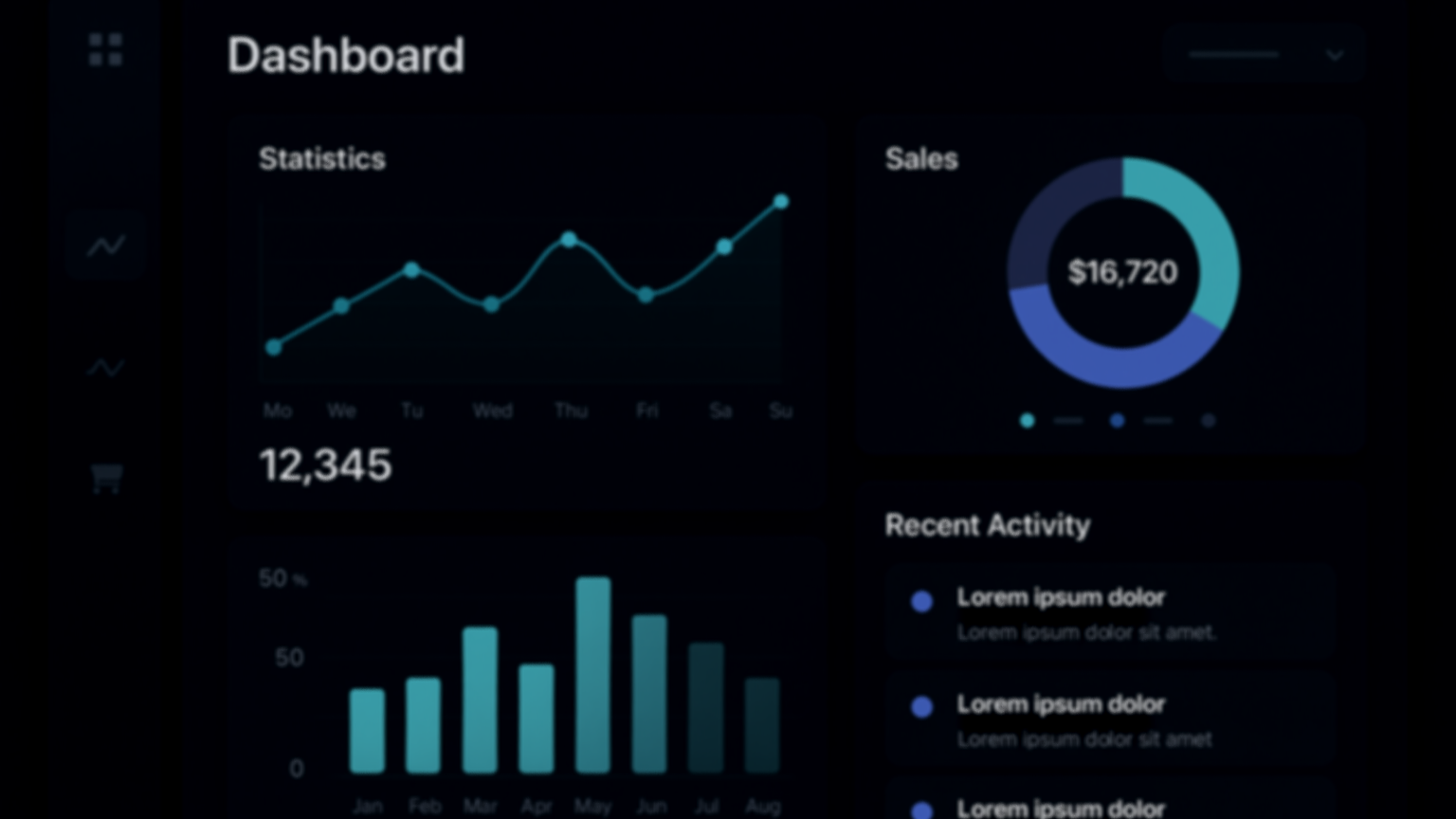
The dashboard is the first thing users see — a home base for threat visibility, asset monitoring, and response. I redesigned it to support different types of users with a bank of prebuilt widgets, enabling customisation without cognitive overload.
For: CyberOwl
My Role: Product Designer
Tools: FigmaFOCUS AREAS:
Multi-Persona Design
Customisation UX
Dashboard Design
Information Architecture
UI Design
Results
Widget-based customization enabled each persona to surface their critical metrics first
The widget model reduced onboarding friction and helped users make sense of the platform from day one.
Post-launch feedback from Customer Success team: "New users now ask 'how do I...' questions instead of 'what am I looking at?' questions" - Customer Success team
Design system expanded with 12 reusable widget components that could be applied across other platform areas
The challenge:
CyberOwl serves vastly different users:
Lone IT operators on small vessels who need quick risk snapshots
Enterprise security teams managing fleets of 50+ ships who need trend analysis
Compliance officers focused on policy adherence metrics
Technical vs. non-technical users with varying cyber maturity levels
The original dashboard was static and one-size-fits-all. It either showed too much (causing information overload) or too little (leading users to distrust the tool). Different personas couldn't surface what mattered most to them, leading to:
High onboarding friction ("I don't know where to look first")
Low feature adoption (critical data buried in generic views)
Support tickets asking "What am I supposed to do with this?"
My role:
I owned the UX and UI design for the new dashboard, collaborating with engineering, product, and customer teams. I conducted discovery interviews and usability reviews to understand what "home base" meant across different segments — and turned those needs into a flexible, modular system.
The approach:
I interviewed users to map out what mattered most when landing on the dashboard — from risk scores to asset discovery, incidents, and compliance. The most important finding was that static summaries either showed too much (causing stress/confusion) or too little (leading to tool distrust).
The solution:
Introduced a “bank of widgets” — reusable, focused modules like:
– Fleet risk score + incident breakdown
– Risk over time
– Vessels/assets at risk
– Incident response performance
– Asset discovery + USB inventory trends
Users can now choose which widgets appear on their own dashboard, tailoring the view to reflect their role and what matters most
Kept widget content curated and clean — to reduce information fatigue while ensuring data stays actionable
The approach
I started with user research to understand what "home base" meant across different segments:
Discovery interviews with 8 users across 3 personas (IT managers, compliance officers, fleet operators) to map their daily workflows and priority metrics
Usability review of the existing dashboard to identify where users got stuck, what they ignored, and what they repeatedly asked for
Competitive analysis of dashboard customization patterns in security tools (Datadog, Splunk) and general SaaS platforms
Key Research Insights
1. No two users cared about the same metrics first
IT managers wanted risk scores and incident breakdowns
Compliance officers needed policy deviation trends
Fleet operators cared about asset discovery and USB inventory
2. Static summaries created stress, not clarity
Users described feeling "overwhelmed" by information they didn't need
When critical data was buried, users assumed the platform wasn't monitoring it
3. Users wanted control, not complexity
They wanted to choose what appeared on their dashboard
But they didn't want to build it from scratch—they needed sensible defaults
The insight: The dashboard shouldn't show everything—it should show what matters to THEM.
The Solution
I designed a modular widget system that balanced flexibility with simplicity:
Widget Bank Approach
Created a library of focused, reusable widgets:
Fleet risk score + incident breakdown
Risk trends over time
Vessels/assets at risk
Incident response performance
Asset discovery status
USB inventory trends
Compliance policy deviations
Each widget contained curated, actionable data—no noise, no clutter.
Customization Without Overwhelm
Default configurations based on user role (set during onboarding)
IT Manager view: Risk score + incidents + response time
Compliance Officer view: Policy deviations + fleet compliance trends
Fleet Operator view: Asset discovery + at-risk vessels
Easy customization: Users could add/remove/rearrange widgets via a simple "Customize Dashboard" mode
Progressive disclosure: Advanced metrics available in widget settings, but not forced on users
Information Architecture
Each widget followed a consistent structure:
Headline metric (the "so what")
Trend indicator (up/down, improving/worsening)
Quick action (drill into details if needed)
Clean visual hierarchy to reduce cognitive load
Widget Detail State:
Clicking into a widget reveals deeper detail without leaving the dashboard context. Users can drill down when needed, but aren't forced to see everything at once.

Main Dashboard View:
The customized home screen showing the user's selected widgets. Each widget surfaces key metrics with clear visual hierarchy—risk scores, trend indicators, and quick actions.

Design decisions
Why widgets instead of tabs or filters?
Widgets let users see multiple priority metrics simultaneously without switching views. Tabs would have forced sequential navigation; filters would have required repeated configuration.
Why defaults instead of blank slate?
A blank dashboard = decision paralysis. Defaults gave users a working starting point they could refine, rather than forcing them to build from scratch.
Why limit the widget bank?
Too many options = complexity. I focused on the 8-10 most requested metrics from research, ensuring each widget solved a real user need.
Reflection & What I Learned
This project reinforced a principle I now apply to all multi-persona products: flexibility doesn't mean infinite options—it means giving users control over what matters most to them.
The widget-based architecture solved the core tension: different users needed different views, but we couldn't create 10 separate dashboards. By making the building blocks modular and the defaults smart, we let users customize without overwhelming them.
What changed after launch:
The widget pattern became CyberOwl's standard for features requiring persona flexibility
Customer Success reported a noticeable shift from "What does this mean?" to "How do I do X?"—a signal that users now understood the platform faster
The design system's widget library was adopted by two other product areas
What I'd do differently:
I would have tested widget preset "bundles" (e.g., "Compliance Officer Starter Pack") to speed up onboarding even further. Some users still spent time customizing when a one-click preset would have worked.
The principle I carry forward:
When designing for multiple personas, ask: "Can I design the building blocks instead of the final solution?" Modular systems that users can compose are often more powerful than trying to predict every use case upfront.